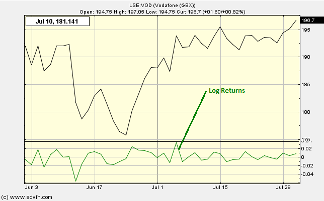
The Log Returns chart study plots the (logarithm of) one day return on owning the symbol. That is, the (logarithm of this) period's prices divided by the last period's price. The reason we take the log of the returns is to scale their values for multiple symbols, and show them on one graph, with one scale (-0.1 to 0.1) at the bottom of the chart.
If there is an overlay present before the Log Returns study is selected, the difference in returns between the two symbols will be displayed.
No parameters.
Log Returns

Here is an example of the Log Returns chart study (on a London Stock Exchange graph)
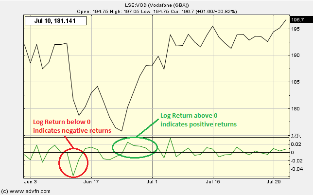
Larger positive or negative values (i.e. closer to 0.1 or -0.1) indicate larger positive or negative returns respectively.
Reading the study:

Here is an example of the Log Return and the price line (for Vodafone), and what it may indicate

It looks like you are not logged in. Click the button below to log in and keep track of your recent history.
Support: +44 (0) 203 8794 460 | support@advfn.com
By accessing the services available at ADVFN you are agreeing to be bound by ADVFN's Terms & Conditions