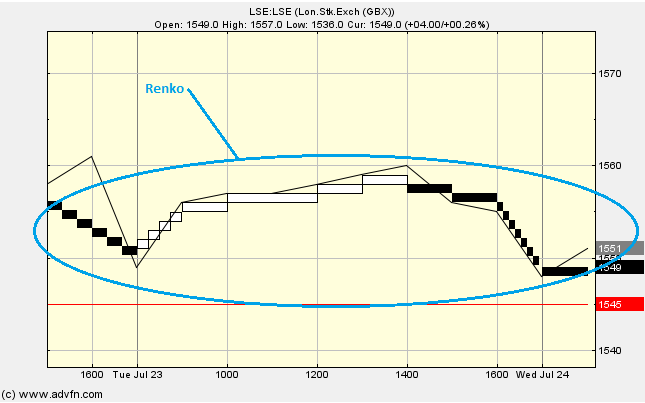
The Renko chart study focusses on price movement and not time or volume [traded]. We see either white or black bricks which are used during an uptrend or a downtrend respectively. A new brick is drawn when the price passes the top or the bottom of the previous brick, by a predefined, selected amount (this amount can be changed under 'edit'). If the price is higher then a white brick is drawn, conversely for black.
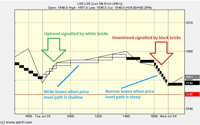
We see that during periods where the price level path is steep, there are lots of narrow boxes, while wider boxes are seen when the price level path is shallower.
The "Recalc box size" under 'edit' simply resets the box size back to 1.
Parameters: Box size & recalc box size.
For additional help on what the different parameters mean, that isn't included on this page, click here.
Renko

Here is an example of the Renko chart study (on a London Stock Exchange graph (Barclays))
The simplest interpretation of the Renko chart study is that uptrends/buy signals are indicated by white bricks, while downtrends/sell signals are indicated by black bricks. These signals can be useful when trying to identify trend direction. A sensible tactic can sometimes be to wait untill two or three bricks of the same colour are in succession before taking a position.
Reading the study:

Here is an example of the Renko and the price line (of the London Stock Exchange (Barclays)), and what it may indicate

It looks like you are not logged in. Click the button below to log in and keep track of your recent history.
Support: +44 (0) 203 8794 460 | support@advfn.com
By accessing the services available at ADVFN you are agreeing to be bound by ADVFN's Terms & Conditions