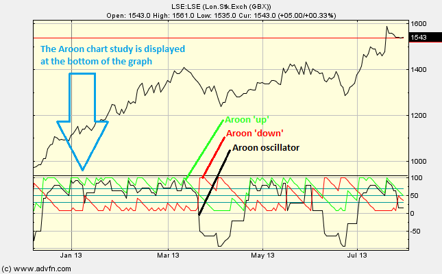
The Aroon chart study shows three lines at the bottom of the chart. The green line is the Aroon 'up', the red line is the Aroon 'down' and the black line is the Aroon oscillator. The Aroon up and down are measured on a scale between 0 and 100, while the Aroon oscillator is measured on a scale between -100 to 100. The Aroon oscillator is the difference between the Aroon up and the Aroon down and is calculated by subtracting the Aroon down from the Aroon up.
But what is the Aroon up and the Aroon down?
The Aroon chart study looks at time relative to price (differing from the Momentum Studies which look at price relative to time). The Aroon indicators measures the number of periods since the price level was at an 'n' period high or low.
For example: if the period was set to 14, the Aroon up measures the number of periods since a 14 period high. Furthermore, if we were looking at a one year chart set to measure daily changes, this would mean that the Aroon up would measure the number of days since a 14-day high. Conversely, leaving our parameters the same, the Aroon down would measure the number of days since a 14-day low. This difference is then 'normalised' if you like and displayed as a percentage difference (hence the scale 0 to 100 is a percentage difference).
The main assumption underlying this indicator is that a stock's price will close at record highs in an uptrend, and record lows in a downtrend.
You can vary the selected period under 'edit'. The Aroon chart study can give long term indications of trend, or short-term indications of trend with either large or small time periods respectively. You may also choose to show, or not, each of the three separate lines.
Parameters: Show Aroon oscillator, Aroon up & Aroon down.
For additional help on what the different parameters mean, that isn't included on this page, click here.
Aroon

Here is an example of the Aroon chart study (on a London Stock Exchange graph)
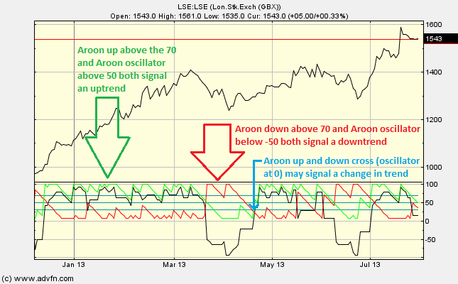
When the Aroon down is above the 70 line and the Aroon up is below the 30 line, then the market is in a downtrend. Conversely, when the Aroon up is above the 70 line and the Aroon down is below the 30 line, then the market is in an uptrend.
When looking at the Aroon oscillator, above 50 is considered a strong uptrending market, below -50 means that the market is trending lower and finally near 0 means that the market is in transition and not trending.
A change in trend can be signalled when the up and down Aroon lines cross.
This study is similar to the Directional Movement Index in the Average Directional Index/Direction Movement Indicator (ADX/DMI) chart study.
Reading the study:

Here is an example of the Aroon and the price line (of the London Stock Exchange), and what it may indicate

It looks like you are not logged in. Click the button below to log in and keep track of your recent history.
Support: +44 (0) 203 8794 460 | support@advfn.com
By accessing the services available at ADVFN you are agreeing to be bound by ADVFN's Terms & Conditions