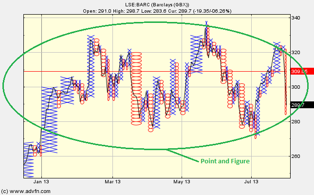
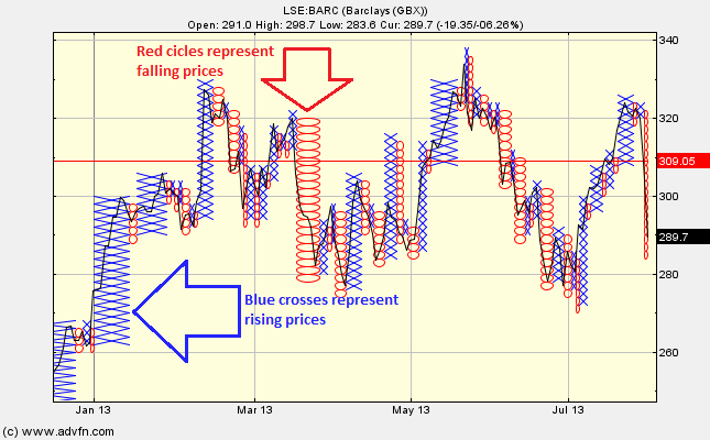
The Point and Figure chart study is overlayed onto the price level and consists of red circles and blue crosses. These O's and X's form columns, these colums consist of either O's or X's and never both. Rising prices are represented by the blue crosses, while red circles represent falling prices. The columns alternate between red circles and blue crosses.
Similar to the Renko chart study, Point and Figure focusses on the price level only and time is not taken into account. Point and Figure can be useful in filtering out irrelevant fluctuations in the price level, and focus on underlying strong price trends. Can also be used to identify support and resistance levels. When the price moves beyond these levels, then this can indicate buy/sell signals.
The study stretches to fill whatever data you are currently viewing, and when you start the study or change the viewing frequency (eg from daily to monthly) it will recalculate suitable box size and reversal values, each manually adjustable under 'edit'. NB box size is expressed in price units.
Parameters: Box size, reversal & recalc box size.
For additional help on what the different parameters mean, that isn't included on this page, click here.
Point and Figure

Here is an example of the Point and Figure chart study (on a London Stock Exchange (Barclays) graph)
The columns hight is representative of the change in price, while the width shows the duration of the trend. The individual O's and X's are all the same height, they simply vary in width. In general, time scale becomes more dense when there are less price movements and less dense when there are more.
Extra circles or crosses are added when the price moves up or down by a selected amount, this is known as the box size (box size is adjustable under 'edit'). The "Recalc box size" under 'edit' simply resets the box size back to 1.
Note that Point and Figure always uses full boxes, so a difference in value of half the box size will not draw another box. The revearsal parameter indicates the number of box sizes that the signal needs to follow against the current trend, to break that trend.
Reading the study:

Here is an example of the Point and Figure and the price line (of the London Stock Exchange (Barclays)), and what it represents
(See picture below)
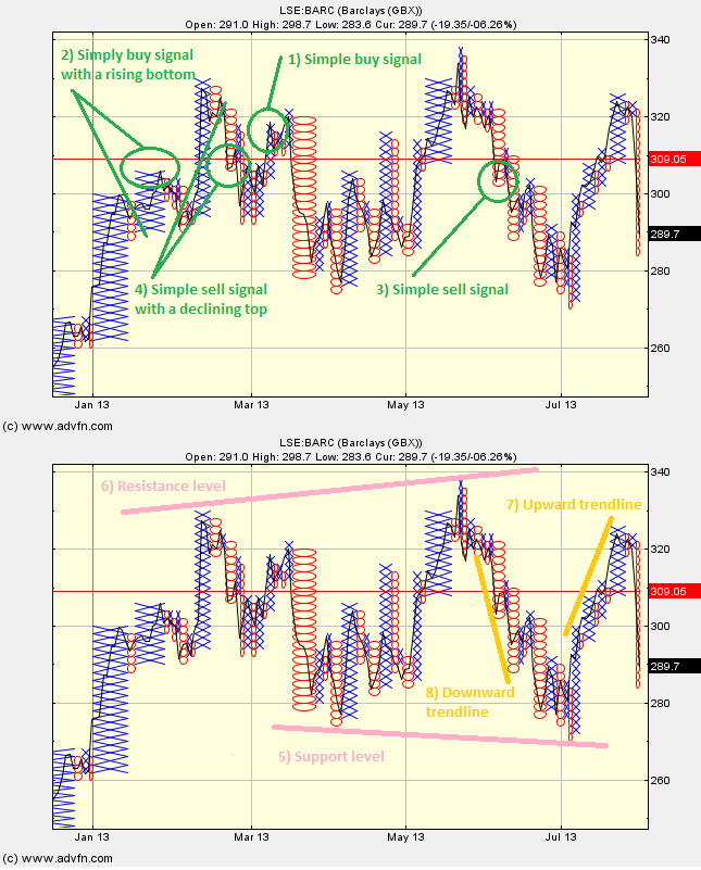
1) Simple bullish buy signal:
    X <--- BUY
X  X
XOX
XOX
  O
2) Simple bullish buy signal with a rising bottom (stronger):
      X <--- BUY
  X  X
OXOX
OXOX
O
3) Simple sell signal:
  X
OXO
OXO
O  O
    O <--- SELL
4) Simple sell signal with a declining top (stronger):
X
XOX
XOXO
  OXO
  O  O
       O <--- SELL
5) Support level (the price at which most investors agree that prices will go up):
        X
    X  XO
X  XOXO
XOXOXOX
XOXOXOXO
XOXO OXOXO
  O     OXOXO
         O  O  O
         +  +  + support level
6) Resistance level (the price at which sellers typically outnumber buyers):
+  +  + resistance level
X  X  X
XOXOXO
XOXOXOX
XOXOXOXO
XOXO  OXOX
  O      O  O
7) Upward trendline:
        +
   +   X
+  X  XO
X  XOXO
XOXO  O
XO
8) Downward trendline:
       X
X  X  XOX
XOXOXOX
  O  OXOX
  +  O  OX
      +  O
          +
Patterns and Lines:

Here is an example of the Point and Figure and the price line (of the London Stock Exchange (Barclays)), and what it may indicate

It looks like you are not logged in. Click the button below to log in and keep track of your recent history.
Support: +44 (0) 203 8794 460 | support@advfn.com
By accessing the services available at ADVFN you are agreeing to be bound by ADVFN's Terms & Conditions