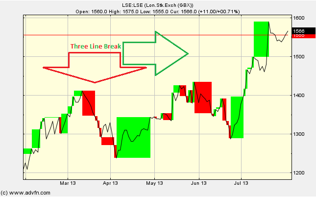
The Three Line Break chart study is similar in concept to the Point and Figure and Renko chart study, it is time independant and focusses on the price level's trend, and any reversals. We see both red and green columns, which represent price level falls and rises respectively.
Parameters: Line Break.
For additional help on what the different parameters mean, that isn't included on this page, click here.
Three Line Break

Here is an example of the Three Line Break chart study (on a London Stock Exchange graph)
First we must under stand two line breaks before looking at the Three Line Break chart study.
The blocks drawn are dependant on the high & low of the previous block. That is, a block is only drawn when the price level exceeds the high or low of the previous block. During an uptrend, a new 'up' block (green) is drawn if the closing price is higher than the previous close, conversely, during a downtrend, a new 'down' block (red) is drawn if the closing price is less that the previous close.
Here is the tricky bit, what happens when there is a reversal in trend? When the price level changes direction, for example from an uptrend into a downtrend, the price must be less than the previous three blocks lowest values before it is drawn. Thus when the price level changes from a downtrend to an uptrend, the price must exceed the previous three blocks highest values before it is drawn. If the reversal in trend is less than the height of the previous three blocks then no change is drawn.
This "more-or-less than the previous three blocks" rule is not fixed, you can adjust the sensitivity of the study so that a new block is only drawn when the price is higher or lower than the previous 1,2,3,4.. boxes etc. Simply click 'edit' and change the number of Line Breaks. This adjustment can allow the study to neglect small changes and focus on the general trend.
Reading the study:

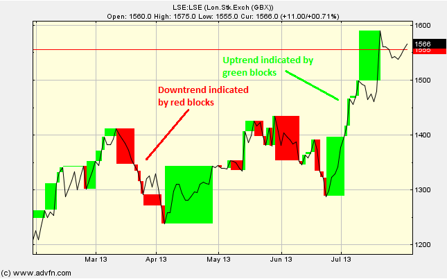
Here is an example of the Three Line Break and the price line (of the London Stock Exchange), and what it may indicate
A green block indicates an uptrend and thus a buy signal, vice versa for red blocks and sell signals. This chart study shows signals well after a trend has established as oppose to indicating peaks and troughs. This can be seen as an advantage as it can be safer when buying, but a disadvantage if you are already in the market as it can be late in showing a trend reversal.

It looks like you are not logged in. Click the button below to log in and keep track of your recent history.
Support: +44 (0) 203 8794 460 | support@advfn.com
By accessing the services available at ADVFN you are agreeing to be bound by ADVFN's Terms & Conditions