We could not find any results for:
Make sure your spelling is correct or try broadening your search.
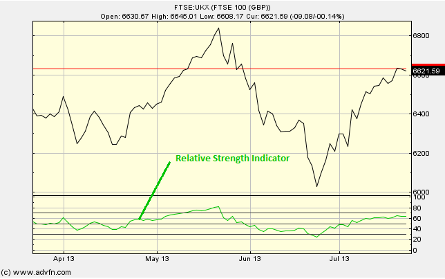
The Relative Strength Index (RSI) chart study is displayed at the bottom of the graph, and has a range from 0 to 100. It measures the differences in magnitude for gains and losses for the selected period (which can be changed under 'edit').
The way in which this difference in magnitudes is measured is by separating the upwards moves [of the price level], from the downward moves, and then taking the Exponential Moving Average of each.
Parameters: Period.
For additional help on what the different parameters mean, that isn't included on this page, click here.
Relative Strength Index

Here is an example of the Relative Strength Index chart study (on a FTSE 100 graph)
Two cases:
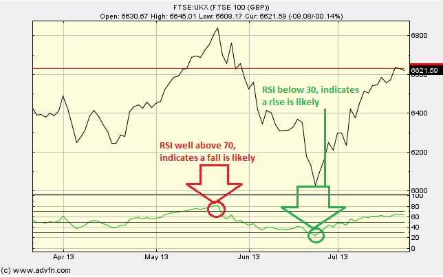
1) If the RSI reaches 70 or above, then the price level might be getting too high and is thought to be overbought, this could be a sell signal.
2) If the RSI reaches 30 or below, then, then the price level might be getting too low and is thought to be oversold, this could be a buy signal.
When using RSI, remember large movements (in both directions) of the price will affect the RSI by creating false buy or sell signals. So it is best to use this valuable chart study along side another.
Reading the study:

Here is an example the RSI and the price line (of the FTSE 100), and what it may indicate

It looks like you are not logged in. Click the button below to log in and keep track of your recent history.
Support: +44 (0) 203 8794 460 | support@advfn.com
By accessing the services available at ADVFN you are agreeing to be bound by ADVFN's Terms & Conditions