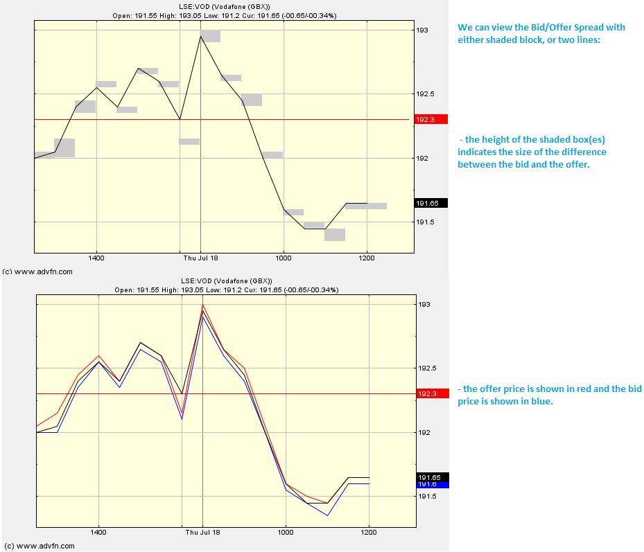
Sometimes referred to as the Bid/Ask Spread, the Bid/Offer Spread shows us two prices. These two prices are the price you buy/enter the market at (i.e. the lowest point that you can buy at), and the price that you sell/leave the market (i.e. how much you can sell your security for).
We refer to the 'buy' price as offer, and the 'sell' price as bid. The offer price, shown in red here, will always be higher than the bid price, shown in blue. The highest bid price and the lowest offer price are plotted on the graph for the selected period. The difference between these two prices is known as the [Bid/Offer] spread (the offer price minus the bid price). This spread is the price that you are already in deficit (on each unit purchased).
Parameters: Choice between lines or shading.
Bid/Offer Spread

Here is an example of the Bid/Offer Spread chart study (on a Vodafone price level graph)
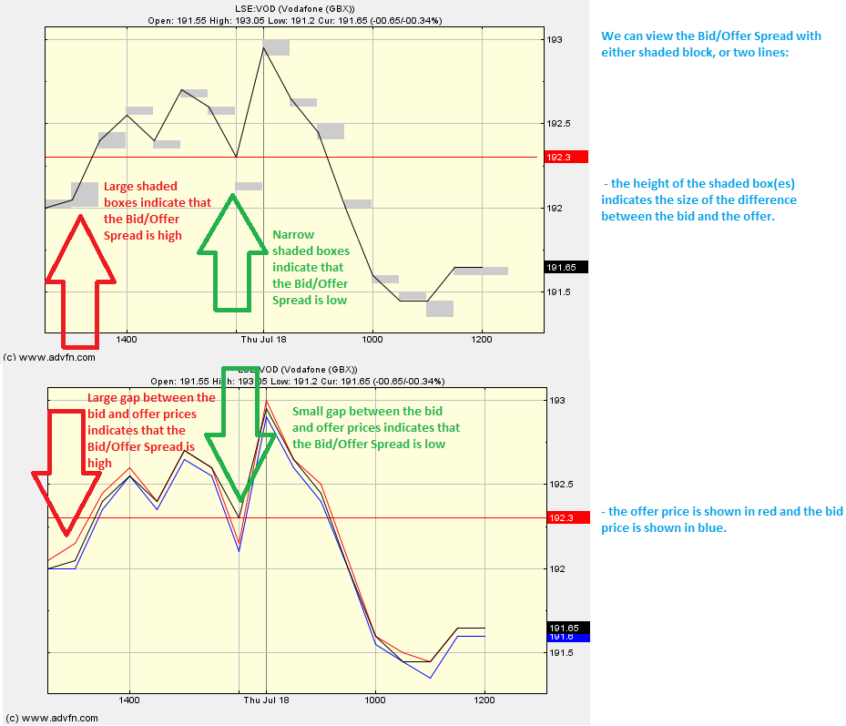
The smaller the spread the better it is for an active individual in the market. The larger the spread, the greater the profits made by the market maker.
We tend to see assets with a high liquidity (e.g. currency) have a smaller spread, and vice versa.
N.B. Occationally the bid price can become higher than the offer price, this happens when the volume of orders gets so high the trading floor can not 'keep up'.
Reading the study: Bid/Offer Spread

Here is an example of the Bid/Offer Spread (on a Vodafone price level graph), and what it may indicate

It looks like you are not logged in. Click the button below to log in and keep track of your recent history.
Support: +44 (0) 203 8794 460 | support@advfn.com
By accessing the services available at ADVFN you are agreeing to be bound by ADVFN's Terms & Conditions