We could not find any results for:
Make sure your spelling is correct or try broadening your search.
The Price Oscillator chart study is used to identify overbought and oversold conditions. It is calculated as the difference between two Moving Averages (See Multiple Moving Averages, and scroll does to 'crossings'). One moving average is a short-period moving average, while the other is long (the periods of which can be changed under "edit"). Basically, it makes it easier for us to see when two Moving Averages crossover, and is displayed as a percentage difference of the two. This percentage difference is of the larger Moving Average.
Parameters: Period for fast and slow & use Exponential Moving Average.
For additional help on what the different parameters mean, that isn't included on this page, click here.
Price Oscillator

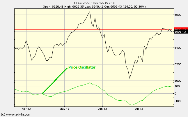
Here is an example of the Price Oscillator chart study (on a FTSE 100 graph)
Similar to other chart studies such as the Chaikin Oscillator or Disparity Index, we focus our attention of when the Price Oscillator crosses the 0 line, either from above or from below.
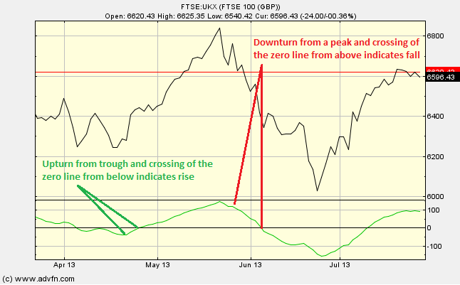
When the Price Oscillator turns up from a trough, and/or crosses the 0 line from below, this is a buy signal, and when it turns down from a peak, and/or crosses the 0 line from above, this is a sell signal.
Reading the study:

Here is an example the Price Oscillator for a price line (of the FTSE 100), and what it may indicate

It looks like you are not logged in. Click the button below to log in and keep track of your recent history.
Support: +44 (0) 203 8794 460 | support@advfn.com
By accessing the services available at ADVFN you are agreeing to be bound by ADVFN's Terms & Conditions