The Moving Average Convergence Divergence (MACD) chart study is used as an indicator of momentum and general trend in a share's price level, as well as giving buy and sell signals.
Parameters: Period 1 & 2 and period sig.
For additional help on what the different parameters mean, that isn't included on this page, click here.
MACD - Moving Average Convergence Divergence

Here is an example of the MACD chart study (on a Vodafone graph)
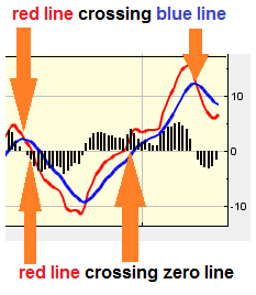
The MACD indicator shows a red line, a blue line and a histogram (bar chart). The study uses Exponential Moving Averages (EMAs). The red line is formed by subtracting a long period Moving Average, from a shorter period Moving Average. This line is often refered to as the MACD or the fast line. The blue line is a Moving Average of the red line. This line is often refered to as the MACD signal line, or the slow line. The histogram (bar chart) shown on the study represent the difference between the red line and the blue line. It is calculated by subtracting the blue line's value from the red line's.
 Here is an example of the MACD fast and slow lines crossing, and what it may indicate
MACD can be read in a few different ways. When the red & blue lines cross, this can indicate different signals. The red line crossing over, and moving above, the blue line is seen as a buy signal. The blue line crossing over and moving above the red line is seen as a sell signal.
The red line crossing the zero line can also indicate different signals. The red line crossing over and moving above the study's zero line is seen as a buy signal. The red line crossing over and moving below the study's zero line is seen as a sell signal.
Divergence can also be used as an indicator. The red line moving in the opposite direction to the recent general trend of the share price may indicate that the trend is nearing an end.
The settings for the study can be modified by clicking the 'edit'. The values in Period 1 and 2 represent the periods used for the short and long Moving Averages used to calculate the red line. Period 1 is the shorter period Exponential Moving Average, Period 2 is the longer. Period Sig is the period used for the Exponential Moving Average represented by the blue line.

It looks like you are not logged in. Click the button below to log in and keep track of your recent history.
Support: +44 (0) 203 8794 460 | support@advfn.com
By accessing the services available at ADVFN you are agreeing to be bound by ADVFN's Terms & Conditions